Component overview

Accordion
Accordion

Alert

AttachedInputs

Badge

Box

Breadcrumb

Button

Button Group

Card (deprecated)

CardSelect

Checkbox

ChoiceChip

CloseButton

Combobox

Content loader

Datepicker

Divider

Drawer

Floating Action Button

FormControl

Full screen loader

Heading

IconButton

Image

Info Select

Input

Line tags

Lists

MediaController

Modal

NativeSelect

NumericStepper
Pagination

PasswordInput

PhoneNumberInput
PressableCard

ProgressBar

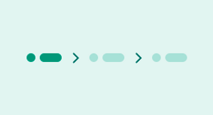
ProgressIndicator

ProgressLoader

Radio
RadioCard

SearchInput

Skeletons

Spinner

Stack
StaticCard
Stepper

Switch

Table

Tabs

Text

TextArea

TextLink

TimePicker

Toast
