The design process
On this page, we will try to give you an overview of how we work at Vy, what tools we use, and how to get started as a new designer when working (digitally) with our brand.
How do we work?
We are committed to creating good solutions for our customers. Therefore, it is important for us to test hypotheses, explore different solutions, talk with our customers, and receive feedback from those who use our services. We aim to be innovative and able to pivot quickly if we need to change something, continuously working to create good solutions and user experiences. We will measure everything we do, and based on this insight, we will iterate and improve our services.
The Vy brand
Our brand was developed by Snøhetta. It is compiled in a Brand book. This is the core of everything we create and do, and the fundamental thoughts behind the experience we want our customers to have when using our services. We work to carry this brand forward in everything we do, and have also made some adjustments to ensure that it also shines on digital platforms.
Nina Tøgard is the brand manager at Vy. Contact her if you have questions related to the profile and brand.
Email: nina.togard@vy.no
Phone: +47 91653264
Verktøy
Our primary design tool is Figma, a cloud-based design and prototyping platform for digital projects. Figma allows collaborative work on projects from virtually anywhere. We utilize this tool for tasks ranging from sketches, flow mapping, prototyping, and user testing to collaboration, feedback exchange, and designing components and final pages for subsequent development.
Other tools
- Slack – We use Slack as communication and coorperation tools.
- Trello – We use Trello for handling our tasks and backlog
- Miro – We use Miro for planning, workshops and user interviews.
- Testflow – We use Testflow to get quick feedback from our users, by testing other solutions and prototypes
- Teams – We use Teams for digital meetings.
- Universell utforming – We use a few different tools for making sure the products we make are accessible. Some of these are Funkify, Contrastchecker, uutilsynet.no, Contrast, and Stark.
- Vy test-app – We use a custom test app, and different test environments on the web to test and validate new services and features.
- Figma Mirror – Makes it possible to test design and sketches directly on our phones
- Google Analytics – Used to collect data and information about our users, so that we can measure and learn.
Cooperation
We usually work in interdisciplinary teams consisting of developers, designers, UX professionals, and product owners. The size of the teams varies depending on the product or flow they are working with. The teams are continuously changing based on focus areas across Vy and the digital department. Each team typically has its own stand-up meetings during the week where ongoing and incoming tasks are discussed. We have planning meetings to discuss future sprints and where the focus should be. And we have retrospectives to discuss how things are going in the team, what we should continue with, and challenges we see.
In addition, we have a joint Designsync every week with a rotating responsibility distribution. Here, all the designers gather to update each other on focus areas and what is being worked on in the different teams. Workshops, project presentations, and design reviews are also held.
In addition to this, we set up meetings as needed, and try to collaborate across teams regularly. Tracks have their own weekly meetings, where it is open for anyone to join if they want to contribute, go through a task, or get feedback on design or Universal Design.
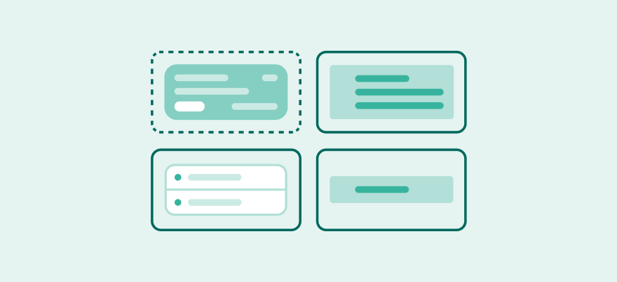
The design system
The design system aims to make design and development faster, easier, and more efficient. We focus on quality assurance for our work while also developing rules and guidelines for design and interaction across platforms and services. Our responsibilities include updating and maintaining component libraries, icon libraries, illustration libraries, as well as usage rules and guidelines. Our goal is to ensure a cohesive, user-friendly, and consistent interface for our customers.
Ansvarsområde
The Spor team is responsible for all building blocks—elements that can be reused independently of flow, design, component, or service. Examples of these building blocks include buttons, layout grids, modals, text styles, or input fields.
We manage various libraries, keeping them up-to-date, exploring improvements, and making adjustments as needed. The libraries we oversee include local Figma libraries, rules and guidelines, and the digital platform online.
However, we do not handle components specific to individual teams, such as tickets, search results, receipts, or pricing details. Nor do we manage each team’s component library. Nevertheless, we facilitate sharing and provide design and component assistance when necessary.
How to use Spor
The Spor team consists of both developers and designers who actively participate in cross-team discussions and projects. They serve as sparring partners for designers and developers, provide training on Figma usage, and review universal design principles. To get in touch, you can send a message to someone on the team via Slack, post in the #spor Slack channel, or create an issue on the nsbno/spor GitHub repository.
If you need new components or variants that don’t currently exist, you can contribute to the design system so that others can utilize them later. The more we adopt, discuss, adjust, and align these components, the greater the impact of having a robust design system. Please see the description of the flow for new components below:
Flow in “Team X”
A team is working on a new flow to enhance our customer experience. The design is based on the design system, but certain elements will be used across multiple teams.
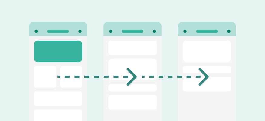
Component
To understand the scope and overall impact, it’s essential to test how this component functions on different surfaces and in various contexts.
Collaboration with other teams
Collaboration with designers from other teams or with Spor members may be necessary to adapt the component’s design for different surfaces.
Development in team “X”
The team that initiated the work completes the necessary components and variants. Development efforts can be shared among the involved teams as needed.
Local deploying
The solution is deployed locally, allowing the design to be finalized and the project to proceed without significant delays.
Suggestions to Spor
While the solution is being used locally, a pull request is made from the responsible team and sent to the design system. Members of the Spor team reviews and approves the component and variants, allowing them to be published in the design system. Adjustments may occur during this process, which will then be pushed back to the team. A final review takes place before the component is officially approved and implemented in the design system.