Accessibility from a technical point of view
Here are some practical tips and tricks, as well as checklists and guidelines, for how to code in accordance with universal design.
Web
Introduction to Web Accessibility
Semantic HTML
If we just wrap elements on a website in divs, it becomes difficult to tell what are headings, paragraphs, etc. This makes it impossible for assistive technologies to determine, because divs are meaningless in themselves. Search engines and screen readers are thus not enlightened.
We can style the elements so that they visually communicate a meaning, but this still doesn't make sense to search engines, RSS readers, and screen readers. In other words, it's not semantic and not very accessible.
HTML offers many elements designed to give meaning to content, including elements for headings and paragraphs. Instead of relying on divs, we can use predefined HTML elements.
A couple of examples: For elements where you should be able to check off one option among several, it makes sense to use radio buttons, and for elements where you should be able to check off several options among many, it makes sense to use checkboxes. Screen readers then read up which element(s) is chosen among several without us having to add this ourselves.
Therefore, think about what role the elements should have, and thus which HTML tag should be used. An exception is if the predefined elements are difficult to style as we wish, then one can use divs as long as one makes sure to put on the correct ARIA roles.
In short, semantic HTML is useful because:
- Search engines can index the content so that it ranks well enough for users to find it.
- RSS readers can analyze and style the elements correctly.
- Screen readers and other assistive technologies can communicate elements correctly to the user.
A few best practices for HTML structure
- Only use a single <h1> element per page
- There are six different heading tags in HTML, <h1> to <h6>. The <h1> tag is the main heading (the subject of the webpage) while the <h6> tag is the least important heading.
- Having only one <h1> element on a website is crucial for search engine optimization (SEO). It helps search engines understand what a webpage is about.
- Having only one <h1> element on a webpage is useful for screen reader users so they understand what are the main sections and what are subsections.
- Do not skip heading levels
- A common navigation technique for screen reader users is to jump from heading to heading to quickly get an overview of the content on the page. Skipping one or more heading levels can create confusion, as the person navigating in this way may wonder where the missing heading is.
- Find and use appropriate semantic HTML elements instead of meaningless divs and spans as much as possible. For example, H elements for headings and P elements for paragraphs.
Using (WAI-)ARIA-attributes
(Web Accessibility Initiative -) Accessible Rich Internet Applications (ARIA) is a set of roles and attributes that define ways to make web content and web applications more accessible to people with disabilities.
It supplements HTML so that interactions and widgets commonly used in applications can be conveyed to assistive technologies. ARIA enables, for example, accessible JavaScript widgets, form hints and error messages, live content updates, and more (in practice, ARIA changes the accessibility tree to achieve this, i.e., adds to or changes the semantics in the tree).
Note: ARIA is useful in certain situations, but starting with semantic, accessible HTML where possible is much simpler and more reliable. That's why the first rule of ARIA is not to use it, but sometimes the native elements simply do not suffice.
Common issues
- Poor Descriptions on Links and Buttons:
- If there is a button or link that only says 'Read more,' which might make sense in the visual context, it doesn't make much sense for screen reader users.
- A screen reader by default reads the text specified in the element, but this can be overridden with an aria-label.
- It's beneficial to strive for good texts on buttons and links, but if a bit more context is needed, aria-label can be used.
- Elements Lacking Context on Their Own:
- Sometimes, individual elements do not provide context on their own. It may then be wise to hide these elements with aria-hidden and instead use an aria-label (or an invisible description) on the parent element so that a text providing more context is read out. In the image below, we see such an example, where each element is originally read out separately. It's better to have a text read out like 'Departure at 15:44. Arrival at 22:27. Travel time is 6 hours and 43 minutes,' etc. It's good to remember to use punctuation in such sentences, as a period causes the screen reader to pause a bit and not read everything in a rush.
- Images or Other Visual Elements (such as Icons and Maps) That Do Not Provide Value to Screen Reader Users:
- If there are icons/images that do not have any ALT text (text that provides a textual equivalent to this), it's somewhat meaningless for the user, as it just reads as 'image' or similar. Therefore, consider just hiding this completely with aria-hidden if the element does not add more than, for example, the accompanying text
- If there are icons/images that do not have any ALT text (text that provides a textual equivalent to this), it's somewhat meaningless for the user, as it just reads as 'image' or similar. Therefore, consider just hiding this completely with aria-hidden if the element does not add more than, for example, the accompanying text
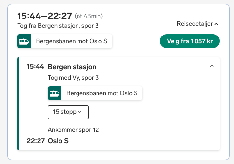
Travel suggestion from Bergen station to Oslo S
Useful attributes and roles
aria-expanded:- Set to true or false, and indicates to the user whether an element can collapse and expand, and which of the states is currently applicable.
aria-controls:- Useful to use if, for example, a button controls another area (e.g., expandable elements that control the area being expanded).
aria-role:- If the element is controlled by another, it should have an aria-role equal to 'region'.
- Can be set on elements that should function as a certain type (e.g., 'homemade' checkboxes, which then get an aria-role equal to 'checkbox').
- aria-role 'alert' can be used for live updates when information arises that requires the user's immediate attention (e.g., critical errors).
- This corresponds to the attribute aria-live='assertive'. This should be set on the information element, not the one that triggers its display. The attribute will interrupt the screen reader in another reading.
aria-live:- In addition to 'assertive', there is also 'polite', which reads new information when the screen reader is finished with other reading.
aria-labelledby:- If the element is controlled by another, it should have aria-labelledby equal to the ID of the element controlling it.
aria-hidden:- Set to true or false (where false is the default), and controls whether an element should be hidden or not from screen readers.
- Useful to use on elements on the website that are secondary and do not provide any value to screen reader users, other than noise.
Useful resources
How to use VoiceOver on Mac
- Activate VoiceOver: System Preferences -> Accessibility -> VoiceOver -> Activate VoiceOver.
- Hold down ctrl+option and use the arrow keys (right and left) to navigate chronologically through the website.
- While holding ctrl+option, use the space bar to click on interactive elements such as buttons and links.
- Some elements are coded as groups, dialogs, or list boxes. To navigate into and out of these, use ctrl+option+shift and the down or up arrow to navigate respectively in or out. For navigation within the elements, use ctrl+option and the arrow keys as usual.
- You can also navigate between headings on the website with ctrl+option+cmd+H."
You can also see an explanatory video here.
How to use NVDA on Windows
NVDA is a modal screen reader, unlike VoiceOver, and one must tell it which mode to be in for different elements (see point 5).
- Activate NVDA: ctrl+alt+N
- Navigate forward through H-tags with the H key (backward with shift+H).
- Navigate from line to line with the up and down arrows.
- Navigate from character to character with the right and left arrows. This can be useful when you want to hear more closely how a word is spelled.
- To turn on forms mode, use caps lock+spacebar. To exit this mode, just use caps lock+spacebar again.
- Some controls are more complex, such as a tab panel. Here, ARIA roles on these will instruct the screen reader to use application mode. Then you can use the arrow keys to navigate around.
- To navigate into complex elements, use tab and shift+tab to exit again.
You can also see an explanatory video here
How to navigate with the keyboard
Navigate forward among interactive elements with tab and backward with shift+tab. When an element is tabbed to, it has keyboard focus.
When a keyboard user navigates through the page, the order in which interactive elements receive keyboard focus is important. The standard keyboard navigation sequence must be logical and intuitive. This usually means that it follows the visual flow on the page – from left to right, top to bottom. For most pages, this means header first, then main navigation, then side navigation (if available), and finally footer. For best results:
- Structure the HTML so that the reading/navigation sequence is correct.
- Avoid element structures that make users tab through many elements, which they could actually skip over, before moving on to the next part of the page (and avoid getting the user stuck without being able to move forward).
- Then, if necessary, use CSS to control the visual presentation of the elements.
- Do not use tabindex values of 1 or higher to change the standard keyboard navigation sequence.
These things are also correspondingly important for screen reader users.
A checklist:
- A link must be able to be activated with enter.
- A button must be able to be activated with both enter and spacebar (must have type 'button', unless it belongs to a form and should have type 'submit').
- A checkbox must be able to be selected and deselected with spacebar.
- For radio buttons, one must be able to jump between choices with the arrow keys.
- In a select (or dropdown menu), one must be able to navigate with the up and down arrow keys and be able to select an item with spacebar.
- A modal (dialog) should retain keyboard focus when it is open (focus trapping), and be able to be closed with Escape, where focus should then return to the element that opened it.
- For a slider, one must be able to adjust the value up and down with the respective up and down arrow keys or right and left arrow keys.
- Scrolling must be possible with the up and down arrow keys.
App
Accessibility for React Native
A checklist
- All interactive React Native components are accessible by default (accessible=true).
- Be cautious if you specifically use the accessible parameter. It will group any child elements into one accessible component, and a screen reader will not allow users to select the individual subcomponents.
- For accessibility labels, it is wise to remember to use full punctuation, otherwise, you may end up with unintentionally long sentences.
- The label should succinctly contain the context.
- Without the label, only the element's text is used (if it contains text), and sometimes this can be sufficient (if it has enough context).
- AccessibilityRole: communicates the purpose of a component.
- AccessibilityState: describes the current state of a component (e.g., selected).
- AccessibilityHint: helps users understand what will happen when they perform an action on the element when this outcome is not clear from the accessibility label.
- AccessibilityLiveRegion: when components change dynamically, we want TalkBack to alert the end-user. This is possible through accessibilityLiveRegion. It can be set to none, polite, and assertive.
How to use TalkBack on Android
- Activate TalkBack: Settings -> Accessibility -> TalkBack -> Toggle on
- Swipe or tap your finger to the right or left to navigate through elements. TalkBack will then read out text, buttons, and other elements.
- Double-tap to activate an element.
- Drag with two fingers to scroll."
Tips:
- Turn on the TalkBack shortcut so that you can turn TalkBack on and off with the volume buttons.
- Choose 'Google Text-to-speech Engine' as the preferred speech engine for text-to-speech.
You can also see an explanatory video here
How to use VoiceOver on iPhone
- Activate VoiceOver: Settings -> Accessibility -> VoiceOver -> Toggle on
- Tap or swipe around on the screen and VoiceOver will read out the elements that are touched.
- Double-tap to activate the element.
You can also see an explanatory video here.
Read about VoiceOver movements here
Adjusting text size
Settings -> Accessibility -> Visibility Enhancements -> Font Size and Style