Introduction
Welcome to Spor, Vy's design system.. For us, Spor is a common language for designers and developers. It is designed to help our teams build holistic user journeys of high quality, both for employees and for our customers.
Spor
Spor contains guidelines for visual design (brand guidelines), finished digital components, documentation and usage, as well as code. We want all designers and developers in Vy to be able to contribute to the design system. Thats why the design system is open and accessible to all on Github.

Vy skal være ansvarlige og pålitelige, saklige og presise. Vi skal gi deg den informasjonen du trenger, når du trenger den.

Bevegelse er kjernen i virksomheten til Vy. Bevegelse er både historien og fremtiden. Vi skal være fleksible og aldri stå stille.

Vy skal være overraskende og sjarmerende, og det vi gjør skal skape glede i hverdagen.
Getting started
There is a lot to learn when you are new to the job, whether you are a developer, designer or product manager. Spor should make it easier to get an overview of everything we are working on, while providing you with useful information and tips on our processes and tools. This page will always be updated to best reflect our goals, ambitions, technology and design.
First out, we recommend that you read through the documentation that is relevant to you. We will post guides where appropriate, and continue to develop our design foundation.
Brand
Vy has a clear and structured design manual that sets the direction for all of us who work in and with the company’s brand. This covers everything from image style and typography, to language and colors. It is important that you familiarize yourself with who “we” are, how Vy as a brand should appear, why we do what we do.
Review the profile. Read about the brand and the core of Vy. Look at the image manner, logo, typography and understand our language profile. Then you have come a long way in working with Vy.
The marketing department is responsible for the visual profile. New outputs of the profile that are to be published by medium and larger character, must go through profile manager Nina Tøgard. This is to ensure a consistent expression across all channels. Contact us if you have questions related to profile and brand.
Email: nina.togard@vy.no
Mobile: +47 91653264

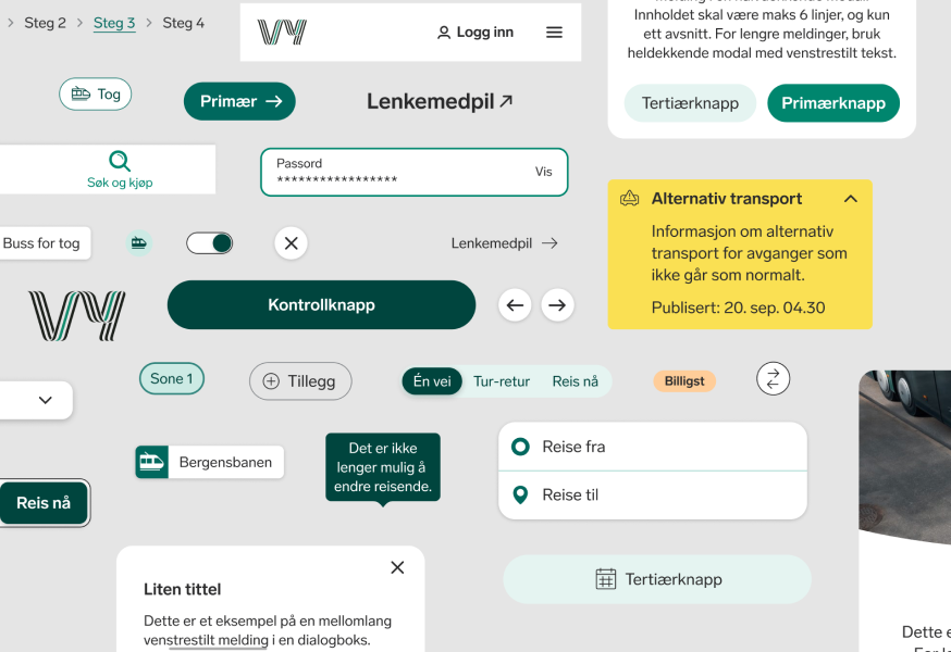
Komponenter
Components are interactive building blocks that make it easier to create complete user experiences. They should come built-in with “states”, variants and interactivity. They have been thoroughly tested and must comply with the rules for universal design and our own internal standard.
They are available here on this platform so you can see how they work. The same components are also available as components in Figma for use by designers.
Each component has some rules and guidelines that must be followed when it is to be used. More information about each component can be found in the component library.
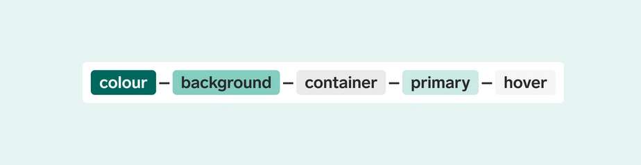
Design tokens
Design tokens Design tokens are all the values you need to construct and maintain a design system. They are the common rules and guidelines that bind everything together. What color can my block have? How should the corners look? How much distance should there be between each block?
They are used instead of hard-coded values to ensure that the design is flexible, simple and updated, and always follows the standard set by the design system. Are you unsure if a design contains the correct color or typography? Then you can just check with the design tokens if this is correct.